


There are more American-heavy neighborhoods than you might expect.
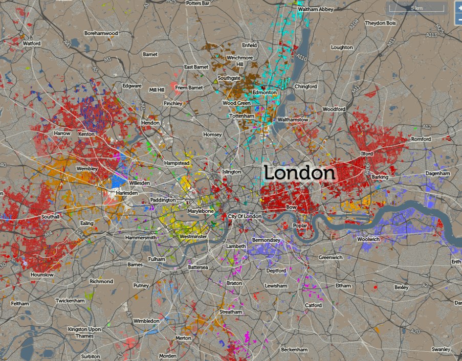
After electing its first Muslim mayor, London’s multiculturalism has been back in the global news. Now a new map shows exactly where the city’s many ethnic groups tend to cluster.
Created by geographer Oliver O’Brien of University College London’s Consumer Data Research Centre, the map also covers the rest of the U.K. and is available in full zoomable form here. Across the country, it shows areas where more than 8 percent of the residents were born abroad. As the street-by-street breakdown makes clear, London has by far the greatest diversity in the country, revealing a city whose demographics continue to evolve and shift.

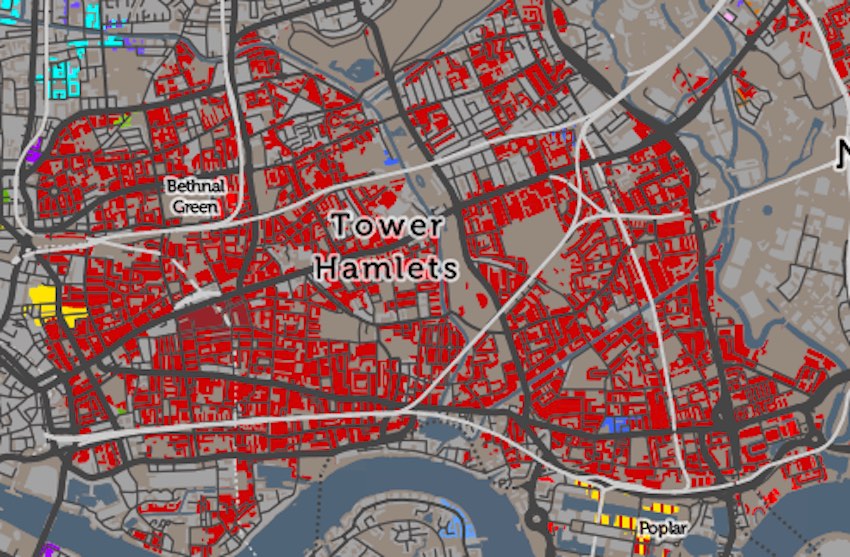
The map confirms much received knowledge about London’s ethnic geography, and it throws a few curveballs, too. Inner East London, for example, reveals a high Bangladeshi population (shown below) in red, with which it has been identified for decades. Zoom in, however, and you’ll notice a new group has arrived. The small pockets of yellow represent Americans—the two small patches on the map below are in close proximity to the financial districts of the City of London and Canary Wharf, suggesting that relatively wealthy U.S.-born workers in these areas are altering the local ethnic map.
From our partners:
Elsewhere, Turkish residents (shown in, er, turquoise) are scattered in a constellation of areas up the Lea Valley. As with Bangladeshis in East London, there has been a Turkish community in this area for decades. What is newer, however, is the concentration of Bulgarians (in brown) and Poles (in burnt orange) to their west and south, both groups having mostly arrived since their home states joined the European Union.

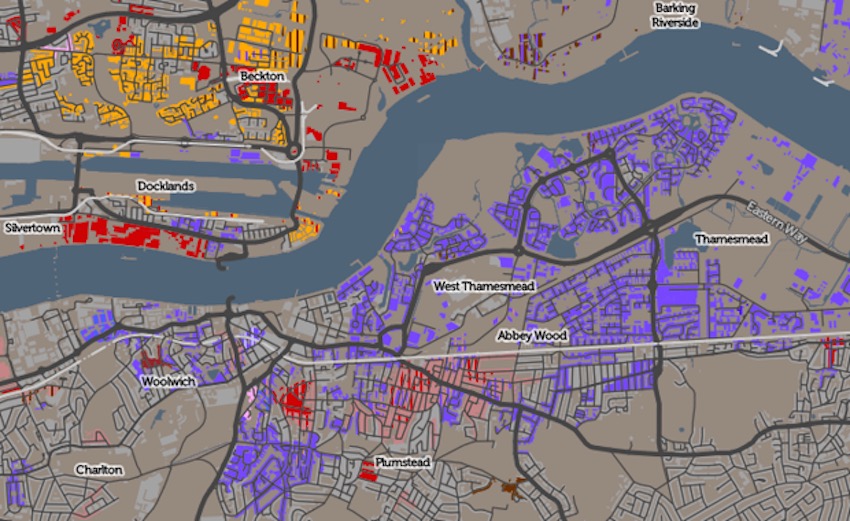
On the other side of the river, people with a Nigerian background (shown in purple) fan out eastwards along the Thames, mainly to its south, while Lithuanian-born residents (shown in orange) cluster on the northern bank.
These bold color blocks are numerous, but it’s important not to draw a false impression from them of the extent to which specific groups predominate. To take an example, that red block to the east of London’s center may look monolithic at first glance. If you drag the cursor over the map, however, you get a percentage breakdown showing exactly what percentage of each micro-area was born in Bangladesh. On closer inspection, this proportion rarely exceeds 30 percent.
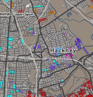 Likewise, the large stretches of grey color do not necessarily contain an overwhelmingly white English population. East London’s Hackney, for example, was long associated with new immigrants. Now, it only shows colored parts in a few sections. This area has undergone rapid gentrification that has increased the number of white English residents, but it nonetheless remains very diverse. You can’t see this because U.K.-born children of first wave immigrant parents are quite rightly not recorded on the map, though they may still identify as a member of a racial minority. Furthermore, the area’s different ethnic groups have now become so geographically integrated that a single group rarely reaches over the 8 percent threshold. As O’Brien notes on his own blog, if you reduce that threshold to 5 percent, the area instantly turns polychrome.
The map also highlights the presence of an immigrant group rarely discussed in debates on London multiculturalism: Americans. Looking at the map, you could be forgiven for thinking American Londoners were very numerous indeed. To some extent they are. In 2013 the U.K. had 197,000 U.S.-born residents. That’s a tiny 0.3 percent of the country’s population of 64.7 million, but a potentially large, scale-tipping number nonetheless if clustered into one place. In London, some concentration of this sort does indeed occur, mainly in a north-south strip running from Hampstead to Chelsea.

The concentration shown here is interesting, but slightly misleading when it comes to density in the area. The southern section of this map close-up, around Hyde Park, is part of the second most densely populated borough in London. The northern section, by contrast, is dominated by large, historic single-family homes that, even now that they’re often broken up into condos, contain far fewer people. Most foreign-born residents in this latter area may be American but, compared to other areas of the city they aren’t necessarily present in high numbers.
There is nonetheless a connecting thread between all these different neighborhoods: wealth. These are some of the richest parts of the city, places whose multicultural character is sometimes overlooked because, hidden away behind trim hedges and high railings, they fit ill with our preconceptions of what an ethnically diverse neighborhood looks like.
This feature originally appeared in Citylab.

From our partners: