


It lets you see exactly how much of the city you can reach in a given time window.
Transportation planner Chris Pangilinan likes to think of a public transit agency as a manufacturer that sells a product, and that product is access. Not rides; sure, we can enjoy the physical act of traveling, but that’s not our primary motivation when we swipe our fare cards. Access: getting to work, getting home, getting to the store, getting somewhere.
“We’re not selling 10 seconds of travel time,” says Pangilinan, who recently joined the New York City Transit Authority after five years at the San Francisco Municipal Transportation Agency. “What we’re actually providing to the public is access to the city.”
San Francisco straphangers now have a phenomenal interactive access map at their disposal thanks to the work Pangilinan did at Muni with then-UC Berkeley grad student Dan Howard. The guide shows transit riders just how much of the city they can reach on trains and buses in a given time window. Though primarily meant for internal agency use—and therefore not yet as user-friendly as it might be—the result is still a transit tool far more useful than most trip planners or apps out there.
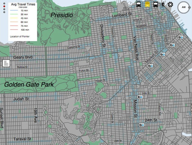
[infobox]The lesson is clear: operating a transit service well is on par with building a new one.[/infobox]Let’s take a closer look. The access maps below are all based on a transit rider standing at the corner of Haight and Ashbury streets. It assumes the rider has a half hour to get somewhere during the morning rush. (A slider at the bottom lets users adjust travel time budgets up to 100 minutes; the circle in the top-right adjusts time of day.) That time budget includes walking to and from a stop or station, in-vehicle time, and wait times.
From our partners:
On a day of average transit service in San Francisco, this rider can access the blue areas within 15 minutes and the green ones within 30:

Now let’s take a look at a bad day of service—done by clicking on the devil-horned-bus at the top. (Since the maps were built based on a sample of 60,000 actual trips between January and March of 2014, the “bad” days represent the bottom-15th percentile of service performance.) As you can see, the splotch of green and blue that shows our rider’s 30-minute access diminishes considerably:
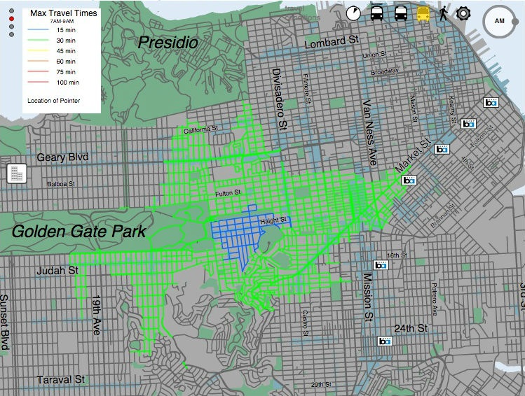
And now let’s look at an especially good day of service—achieved with a click of the haloed bus. (These are defined as top-15th percentile service days.) Access to the city is now so good we have to zoom out to see it all:

The difference between city access on good and bad days is truly astonishing. If San Francisco’s transit agencies could always perform up to the good day standard, says Pangilinan, it would be almost the equivalent of building an entire subway expansion or rolling many more buses onto a route. (And keep in mind the “good” day isn’t even a perfect day.) The lesson is clear: operating a transit service well is on par with building a new one.
“I think right now it’s such a black hole of how transit operations works,” he says. “But if you’re able to link a simple action to how it affects your life, I would like that to spur action from the community to advocate for better transit service—I want better service because it improves my access.”
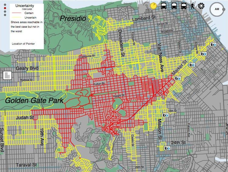
From a rider’s perspective, perhaps the most useful feature of the interactive map is the “reliability” button just to the left of the angel bus. The red lines indicate parts of the city this rider can access in a half hour with a very high degree of certainty. The yellow lines, meanwhile, are places you might get to within 30 minutes, but might not. So if you can’t be late for work, but your office is in the yellow, you know you need to set aside more time to use transit.
Here’s what it shows for our Haight-Ashbury traveler:
“I think it’s a true representation of the transaction people are going through in their heads everyday when they choose to ride transit,” says Howard, who’s now an engineer at Muni. “I’m going to be forking over this much time in order to get here. That’s the goal.”
Transit planners and scholars have made a big push toward access-based maps as more types of service data become available. The San Francisco interactive tool offers more precision than most of these other efforts because it analyses true past performance instead of relying on scheduled performance. Such maps become especially useful when overlaid with geospatial data on, say, jobs or income or even grocery stores with healthy foods.
[infobox]”You can start equating dollars to access.”[/infobox]Everyday trips aside, the San Francisco access map might also serve to evaluate agency spending. For instance, Howard says he plans to update the map with 2015 data and create a button that shows year-to-year changes in access. Over time, such a tool could help assess expansion projects or service improvements; it could also show projected access from future plans to help promote a proposed transit ballot or inform public funding discussions.
“Then you can start equating dollars to access, which is I think ultimately what I’d love to see,” says Pangilinan. “That makes it much easier to argue for transportation projects based on their merits. As opposed to based on what part of the city screams the loudest.”
This article originally appeared in CityLab.
From our partners: