


A new interactive data viz shows flows of refugees seeking asylum as whizzing dots.
Last month Greece reported roughly 10,000 asylum-seekers a day arriving from Turkey. These migrant flows, the country’s highest to date, are just the latest wave of refugees from Syria, Iraq, and other conflict-ridden countries crashing onto European shores.
The sheer scale of this migrant crisis has rocked the world and left European Union leaders grappling for solutions. According to the latest figures released by the United Nations High Commission for Refugees, around 680,400 people arrived in Europe just this year from crisis regions. By the time 2015 wraps up, Germany, Austria, Hungary, Sweden, the Netherlands, and Finland expect a total of 1.3 million asylum applications from around the world, The New York Times reports.

Despite knowing these numbers, it’s hard to grasp the magnitude of the European migrant crisis from afar. So to help visualize it, Helsinki-based data viz company Lucify created an interactive map showing the flow of asylum-seekers to Europe over the last three years.
From our partners:
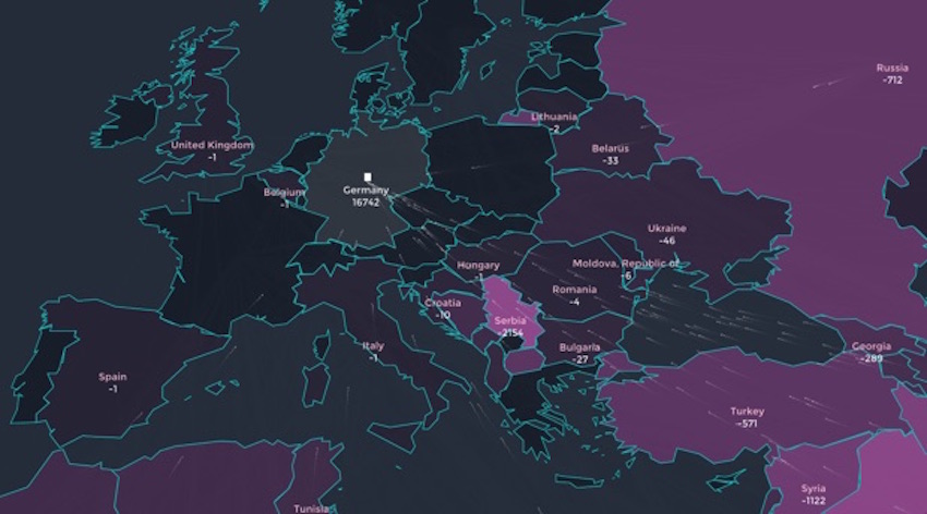
Lucify and developer Ville Saarinen represented the U.N.’s monthly count of asylum-seekers to Europe from 2012 to 2015 as dots flying out from their home country and into their host country. (Of course, in real life, the journeys of these refugees have hardly been that smooth.) Each dot represents 25 to 50 people, depending on the device you use to view the viz. As you hover over each European country, you can see its share of asylum-seekers rise as the timeline runs its course.
“We recognized that such a visualization does not only show the scale of the numbers, but also beautifully tells the story of what those numbers mean,” the creators write on Medium.
Below the map, another infographic shows the exact number of people that moved from one country to another each month. (This graphic is inspired by Sankey diagrams that depict the flow of materials or energy between several points by varying the width of arrows proportional to the quantity.) If you play with the timeline, you can see that by September 2014, Syria has overtaken all other countries in refugee volume. That number keeps climbing in 2015, as the war in the country becomes more and more complicated.
Check out the full data viz below:
This feature originally appeared in CityLab.


From our partners: