


Even with today’s modern technology, able to digitize almost anything, representing the world on a flat map so that it is one hundred percent accurate remains an unmet challenge. This mathematical problem is many centuries old. However, it was not until the mid-sixteenth century that Gerardus Mercator (1512-1594) laid the foundation in improving the graphic representation of planet Earth on a two-dimensional surface.
One solution, which Mercator first applied in 1569, is known as the Mercator projection. Although currently criticized as a symbol of geographical disparities and the arrogance of the first world (Africa and South America are shown as being much smaller than they actually are) Mercator’s intention was very different. In reality, what he wanted to do was facilitate the navigation of the sailors of his day by designing a system in which the trajectories of ships could be drawn with straight lines from compasses.
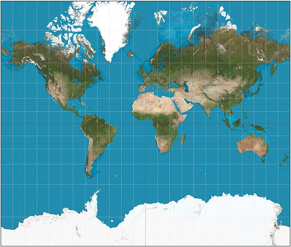
Projections of the cylindrical type, such as that of Mercator, are created by placing a cylinder tangent to the terrestrial sphere. The result shows the whole globe in two dimensions, but there are also major distortions in areas of high latitude, which obscure the true proportions in the polar regions. Thus, in maps based on the Mercator system, Greenland appears almost as large as Africa, which is actually 14 times bigger; Alaska seems similar in size to Brazil, whose area is about 5 times that of Alaska.
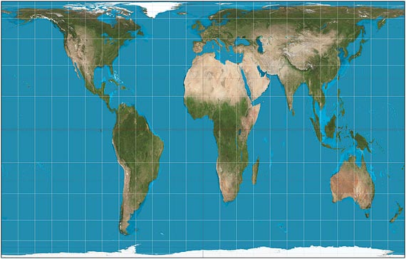
The Peters projection is another famous cylindrical representation, showing the size ratio of the continents in a more balanced way, but it has another flaw – the surfaces and distances are distorted. Other systems solve the problem of proportion, but give us a “limited” image of the globe – the conical projections faithfully represent those countries that are found in the mid-latitude regions, but do not show the whole globe on the same sheet of paper.
From our partners:
 At present, most maps are based on modified projections or combinations of the discussed techniques, in order to correct the distortions as much as possible. Among the most common are included the polyconic projection of Lambert, used for educational purposes, or that of Winkel-Tripel, adopted by the National Geographic Society in 1998 and increasingly used in atlases and textbooks. However, the most widely used maps today remain faithful to Gerardus Mercator: online services like Bing Maps, OpenStreetMap, Google Maps or MapQuest use a variant of the Mercator projection. Additionally, the rectangular maps that are made nowadays of other worlds –Venus, Mars or Mercury, for example– use the system of Gerardus Mercator.
This Flemish astronomer, geographer and mathematician devoted his life to maps. Combining his different specialties, he made very different contributions to cartography. The most important of them, the solution to the problem of bringing the terrestrial globe to a flat surface, despite being an imperfect solution is still very useful and practical. This is why the much-maligned Mercator projection remains in use today.
This feature originally appeared in OpenMind.

From our partners: